Logo & Wordmark

Primary - Light Background
Use this version on white or light backgrounds.

Primary - Dark Background
Use this version on dark or brand-colored backgrounds.

Monochrome - Black
For black and white print or single-color applications.
Monochrome - White
For dark backgrounds where color is not permitted.
Audience
Inclusive Mission Statement
Our mission as a brand to bring all kinds of recipes to all kinds of readers, so we are commited to making our site accesibile. As a brand we want to gurantee that anybody can access our recipes at anytime. Food brings us all together, so it's important it can be shared to anyone and everyone.
Audience Considerations
- Hearing-Impaired Users: Hearing-impaired users require transcripts and captions for any audio content. Any alerts or content must have a visual form that doesn't rely on sound to express it's message. Anything that exists in audio must have a visual/text equivalent.
- Visually-Impaired Users: For visually impaired users its important to make sure visual information can be read by screen readers. For low vision users its important to ensure there is a large enough color contrast and that font is large enough and legible for those with vision impairments.
- Cognitively-Impaired Users: For cognitively impaired users, complex text and content that is overwhelming is hard to get through. To accomodate to these users we strive to use accesible language that isn't confusing. We also strive to break information up to make our site and recipes naviagable for many different audiences.
Voice & Language
Plain Language Guidelines
The target reading level is for adults, but really anyone who can get into the kitchen and cook! We keep our langauge casual, and approachable, so anyone can feel like they can use our recipes. We avoid overly dense and complex language and sentence structure, as to not turn people away from our recipes.
| Do Say (Inclusive/Plain) | Don't Say (Exclusionary/Idiom) |
|---|---|
| You might think fajitas are too fussy for a weeknight, but this easy, sheet-pan version can be ready in an hour. | Making fajitas on a weeknight may seem like a daunting task, one that would consume a lot of time. But its quite the contrary. Utilize this recipe, that allows one to make the fajitas on a mere sheet pan. With this recipe you can accomplish your task in an hours time. |
| Baked pasta doesn’t even have to try to be a cozy, comforting dish. There’s already the bubbling sauce, gooey cheese, and it's sweet smell. | Baked pasta is the pinnacle of comfort dishes. It is the synthesis of coziest elements,bubbling sauce, gooey cheese, the sweet smell of pasta wafting through the house. Nothing could outdo such a fine creation. |
Colors
Brand Palette
Color Usage Policy
Use of Color: Although we have a strong color pallete and colors for success and error states, meaning must not be conveyed with color alone. For example, for error states make sure to label in text what is wrong. You can outline in color and also provide a in-text description of the error. For example, "please enter your email".
Text Contrast Playground
The WCAG 2.1AA guidelines list that for normal text a minimum contrast ratio of 4.5:1 is required. For large text (larger than 18pt), a 3:1 ratio is required. New York Times Cooking has 3 primary colors, white and black for text and various secondary colors. Use the contrast checker below to make sure any pairings meet these contrast minimums.
Preview Text
The quick brown fox jumps over the lazy dog.
Contrast Ratio:
| Standard | Normal Text | Large Text (18pt+ / 14pt bold) |
|---|---|---|
| WCAG AA | ||
| WCAG AAA |
Negative Examples
The following examples illustrate color combinations that fail WCAG AA compliance due to insufficient contrast.
Do Not Use
Light gray text on white background (Fails WCAG AA)
Do Not Use
Black text on dark gray background (Poor visibility)
Non-Text Contrast (UI Elements)
Interactive components like buttons, controls and icons must have a minimum contrast ratio of 3:1 against the background color.
Inline Links
Links within the content must be clearly identified through a few different methods.
- Text Decoration: Inline links in our articles are always underlined to signify that they are links.
- Color Contrast: Our inline link color for its inactive and active state meets a 4.5:1 contrast against the background.
- Hover & Focus: Inline links turn lighter upon a hover interaction and red upon a click.
Typography
Typeface Selection
Primary Typeface: Franklin
Secondary Typeface: Cheltenham
Tertiary Typeface: Karnak
Readability Standards
- Line Height: Body text must have a line height of at least 1.5 to ensure readability.
- Paragraph Spacing: Spacing between paragraphs must be at least 2 times the font size.
- Alignment: Body text should be left aligned for readibility reasons. Text justification should be avoided because it typiccally creates rivers and makes the text hard to read. Right or center alignment may be okay for headings or short phrases, but overall text should be aligned to the left.
- Capitalization: Sans Serif headings may be put in all caps, but it's not preferable. For body text is should be avoided.
Hierarchy Preview
Heading 1 (H1) - [30px/Regular]
Heading 2 (H2) - [24px/Regular]
Heading 3 (H3) - [20px/Regular]
Body Paragraph - [16px/Regular] This demonstrates how the standard reading text will look. Our minimum body text size is 16px.
Here is a sample paragraph: New York Times Cooking has thousands of recipes you will love to cook, from easy weeknight dinners to holiday showstoppers. Editor-curated collections make it easy to find the right recipe, and helpful step-by-step visuals make them fun and simple to cook. We publish new recipes and videos every day.
Imagery
Multimedia Policies
- Text in Images: New York Times cooking uses mostly text in code and advises against text in an image because it is not adaptable or screenreader friendly.
- Video & Audio: Any videos or audio content must include closed captions and/or a transcript.
- Motion Control: Any item that flashes must not flash more than 3 times. Additionally animated or auto-playing elements should include a pause button.
Alt-Text Style Guide
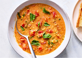
Alt-Text: "Bowl of Creamy Tomato Lentil Soup, with a spoon in it and a plate of a toasted sandwhich to the side."
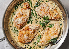
Alt-Text: "Chicken Florentine in a metal pan, 4 chicken breasts in a cream sauce with cheese and spinach. On a gray countertop."
UX & Content Design
Visual UI States
Text Links
Links must be distinguishable by more than just color. Default: Underlined.
This is a paragraph containing a text link to demonstrate the default state.
Button States
Buttons must have a highly visible focus indicator (e.g., outline) for keyboard navigation.
Touch Targets
Interactive elements must have a target size of at least 44x44 CSS pixels to accommodate touch inputs.
Structure & Semantics
- Form Labels: New York Times Cooking makes sure our forms, such as sign up forms, are created in an accesible manner. This means providing labels to all form controls and making sure labels are persistent rather than placeholders which are temporary.
- Heading Structure: Headings must be used in order and not skip around. So the articles shouldn't go from an h1 to an h6. Also headings should correlate with text. For example, a pages main heading should be an h1 not an h4.